Design is thinking made visual. – Saul Bass
Saul Bass couldn’t have said it any better. We use design to make information more engaging because, let’s face it, reading isn’t always fun. Now that everyone’s attention span has declined (like the economy), it’s especially difficult to keep your readers interested and coming back for more.
On that note, here’s the beginning of a series of web design and development principles – with a twist – that you should keep in mind.
Positioning
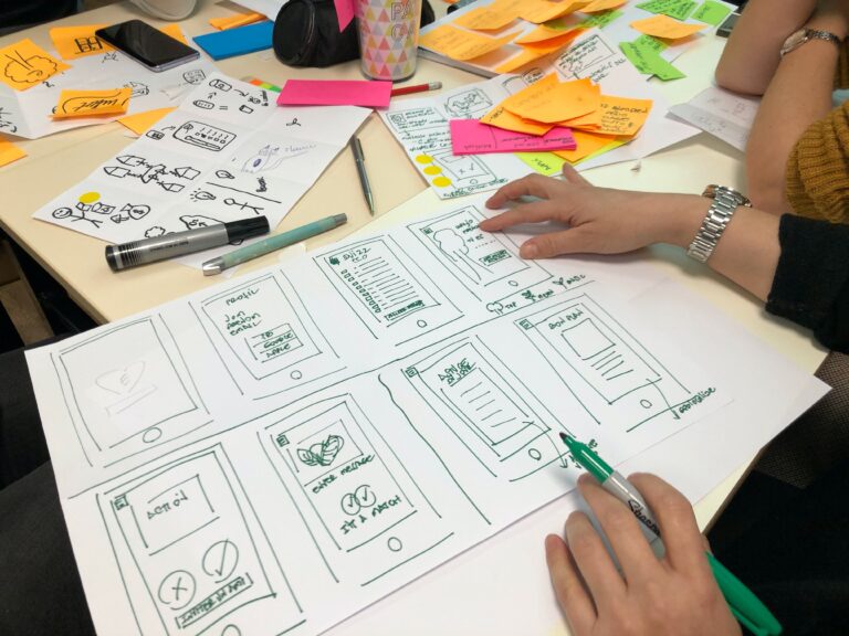
Positioning is vital to every design, so you should always begin with a wireframe – the skeleton of a design’s structure. As you position and place different elements on a page, you have to be aware of several things: hierarchy, usability, learnability, so on and so forth. Each element should be placed where it is for a specific reason – not including “because there’s nowhere else to put it.” You should always design with a purpose. Otherwise, you’re wasting valuable real estate.
Ultimately with design, you’re answering a simple question, “Does this do what I need it to do?” Always clearly define the purpose of your site, and keep it in mind as you continue forth. For example: Unless your website is about your cat, nobody cares to see it on your site. Keep it simple, stupid!
To help you with your wireframe, the design gods bestowed upon us Nathan Smith – the creator of the 960 grid system. The 960 grid system helps standardize web designs and eases the pains of prototyping and production. Think of it as the position that never fails.
Use Toys/Tools
I learned a valuable lesson in tools at a recent Social Media Club Dallas event:
Finding a tool is like dating, you should know what you want and test as many as possible.
Now more than ever, open-source is king, so it’s much easier to find what you need for free. You have the ability to use and test as many tools as you want with few or no consequences. For example, a good way to make a homepage design more interesting is to use a “jquery slider.” Simply Googling those words will lead you to a wide selection. Here, let me show you – http://lmgtfy.com/?q=jquery+slider. Using one is a great way to display multiple snippets of content within the same real estate.
As open source becomes more popular, it becomes easier to enhance a website with otherwise very difficult elements. A little goes a long way, and by using “toys,” you keep your users engaged and bring more purpose to your site.
A great resource for ideas is TutPlus – a wide network of tutorials and resources. Graphics, coding, video – just about anything design related – you can find valuable information from real professionals there. There is a paid premium membership; however, they have a great selection of free content.
Don’t Be Afraid To Try New Things
With the evolution of HTML5 and CSS3 on the horizon, designers and developers are given more wiggle room. We are no longer as dependent on the 1px backgrounds to do all our dirty work. New web standards have raised the bar even higher, leaving the web open to more manipulation.
Coding isn’t the only thing that’s changing, though. Web design and development principles and trends are also evolving. Who needs animated GIFs and marquees anymore? The web is encouraging designers to get out of that empty, old, used-up box and focus on making it a more beautiful place. There’s never a more perfect time to try something new than now. Trying different positions, toys etc. helps spice up every site … and bedroom.


