Welcome to the digital marketer’s toolkit, where landing pages stand out as the unsung heroes in the quest for conversions. These standalone web pages are crafted with a single focus in mind: to take visitors from “just browsing” to “action taken.” Whether it’s signing up for a newsletter, downloading a guide, or making a purchase, landing pages are the launchpad for your digital marketing campaigns.
But here’s the catch: not all landing pages are created equal. The difference between a landing page that converts and one that doesn’t can often be traced back to its design and content.
A well-designed landing page doesn’t just look good; it speaks directly to the visitor’s needs, desires, and pain points, guiding them smoothly towards taking action. It’s about creating a seamless, engaging experience that aligns with the goals of both the business and its potential customers.
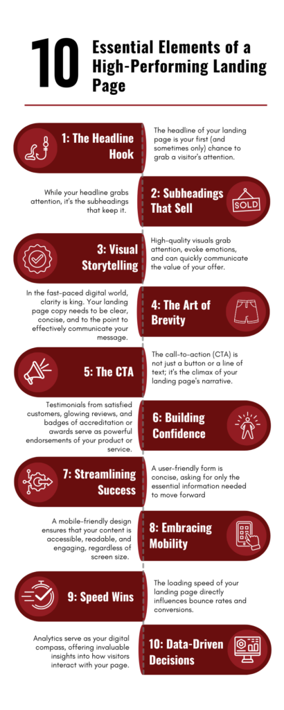
We’re diving into the 10 essential elements that make a landing page not just functional, but high-performing. From compelling headlines to persuasive calls-to-action (CTAs), each element plays a crucial role in converting visitors into leads or customers.
So, whether you’re looking to tweak your existing landing pages or build new ones from scratch, stick around. You’re about to learn how to make your landing pages a conversion powerhouse.
1: The Headline Hook: Crafting Your First Impression
The Power of First Impressions
The headline of your landing page is your first (and sometimes only) chance to grab a visitor’s attention. It’s the make-or-break moment where you either captivate your audience or lose them to the abyss of the internet. A clear, attention-grabbing headline isn’t just important; it’s essential. It sets the tone for the entire landing page and plays a pivotal role in guiding visitors further down the conversion funnel.

Mastering the Art of Headline Writing
Crafting a headline that resonates isn’t about using flashy words or making bold, unbelievable claims. It’s about clarity, relevance, and aligning with your visitor’s intentions. Here are a few tips to keep in mind:
- Keep it concise and to the point: Your visitors should understand the value proposition within seconds.
- Use action-oriented language: Encourage engagement right from the start.
- Highlight the benefit: Make it clear what’s in it for them.
- Test and refine: Use A/B testing to see what works best with your audience.
A compelling headline acts like a beacon, guiding the right visitors to your landing page and setting the stage for everything that follows.
2: Subheadings That Sell: Guiding Your Audience Deeper
The Guiding Light of Subheadings
While your headline grabs attention, it’s the subheadings that keep it. Think of subheadings as the guiding lights along the path of your landing page narrative. They play a crucial role in breaking up text, making your content digestible, and guiding readers through your page. A well-crafted subheading can re-engage visitors who might be skimming, drawing them back into the flow of your message.
Highlighting the Milestones with Subheadings
Subheadings are your opportunity to highlight the key points of your offering, emphasizing the benefits and addressing potential objections along the way. Here’s how to make the most of them:
- Be clear and descriptive: Each subheading should offer value and context, helping readers understand what follows.
- Use them to tell a story: Arrange your subheadings to guide visitors through your narrative, from identifying their problem to presenting your solution.
- Incorporate keywords thoughtfully: While maintaining natural readability, include relevant keywords to support SEO efforts.
By utilizing subheadings effectively, you not only enhance the readability of your landing page but also reinforce the persuasive power of your content, encouraging visitors to continue their journey towards conversion.
3: Visual Storytelling: The Role of High-Quality Images and Videos
Capturing Attention and Boosting Conversions with Visuals
Where a picture is worth a thousand words, the images and videos on your landing page are your visual storytellers. They’re not just decorative elements; they’re powerful tools that can significantly impact engagement and conversion rates. High-quality visuals grab attention, evoke emotions, and can quickly communicate the value of your offer. They make your landing page more memorable and can help visitors envision the benefits of your product or service, making the decision to convert easier.
Selecting the Right Visuals for Your Landing Page
Choosing the right images or videos for your landing page goes beyond just picking high-resolution photos or slick productions. Here are some guidelines to ensure your visuals are working hard for your conversions:
- Relevance is key: Ensure your visuals are directly related to your offer or message. They should enhance the story you’re telling, not distract from it.
- Quality matters: Opt for high-resolution images and professionally produced videos that reflect the quality of your brand.
- Emotionally resonant: Use visuals that evoke an emotional response or connect on a personal level with your audience.
- Testimonials and demos: Consider including video testimonials or product demonstrations to build trust and credibility.
By integrating high-quality images or videos that align with your message and appeal to your target audience, you can transform your landing page from good to great, making it a compelling and engaging experience that drives conversions.
4: The Art of Brevity: Crafting Clear and Concise Copy
The Power of Straightforward Content
In the fast-paced digital world, clarity is king. Your landing page copy needs to be clear, concise, and to the point to effectively communicate your message. Visitors often scan content, looking for information that speaks to their needs and interests. By keeping your copy straightforward, you ensure that your message is understood quickly, making it easier for visitors to make a decision. This approach respects the user’s time and attention, increasing the likelihood of conversion.
Balancing Information with Persuasion
Writing copy that is both informative and persuasive is a delicate dance. Your goal is to educate your audience about your offer while also convincing them of its value. Here are some tips to strike the right balance:
- Focus on benefits, not just features: Highlight how your product or service solves a problem or improves the user’s situation.
- Use active voice: Active voice makes your copy more dynamic and engaging.
- Be specific: Vague statements don’t inspire confidence. Provide concrete details about what you’re offering.
- Create a sense of urgency: Encourage immediate action with time-sensitive language or offers.
Effective copy is the backbone of your landing page, guiding visitors towards taking action. By ensuring your content is both clear and persuasive, you can significantly enhance the performance of your landing page, turning readers into leads and customers.
5: The CTA: Your Conversion Catalyst
The Critical Role of a Compelling Call-to-Action
The call-to-action (CTA) is not just a button or a line of text; it’s the climax of your landing page’s narrative. This is where the rubber meets the road, and visitors decide to take the leap from interest to action. A compelling CTA is crucial because it crystallizes your landing page’s purpose and guides users towards conversion. Whether it’s “Sign Up,” “Download,” or “Buy Now,” your CTA is the gateway to achieving your landing page’s objectives.
Designing CTAs That Stand Out
Creating a CTA that captures attention and motivates clicks requires a blend of design, psychology, and strategy. Here are some elements to consider:
- Visibility: Your CTA should be one of the most prominent elements on the page. Use contrasting colors and sufficient whitespace to ensure it stands out.
- Clarity: The language should be clear and action-oriented. Users should know exactly what will happen when they click.
- Placement: Consider placing your CTA above the fold and then repeating it at strategic points on the page to catch users at different stages of readiness.
- Urgency and value: Communicate the benefits of taking action now. Phrases like “Get started today” or “Limited offer” can add a sense of urgency.
A strong CTA turns passive browsers into active participants. By focusing on clarity, design, and strategic placement, you can create a CTA that not only stands out but also effectively converts visitors into leads, customers, and advocates.
6: Building Confidence: The Power of Trust Signals
The Foundation of Trust: Testimonials, Reviews, and Badges
In the digital realm, trust is currency. Before visitors commit to a click, they need to feel confident in their decision. This is where trust signals come into play. Testimonials from satisfied customers, glowing reviews, and badges of accreditation or awards serve as powerful endorsements of your product or service. They tell prospective customers, “You’re in good hands,” providing the social proof needed to ease concerns and build credibility.
Strategically Incorporating Trust Signals
Effectively integrating trust signals into your landing page can significantly impact its conversion rate. Here are some tips for doing it right:
- Authenticity matters: Use real testimonials and reviews, and if possible, include the person’s name, photo, or company to add legitimacy.
- Relevance is key: Choose testimonials that speak directly to your target audience’s pain points or aspirations.
- Quality over quantity: A few strong, relevant trust signals are more effective than a barrage of less impactful ones.
- Placement: Position your trust signals near CTAs or pricing information, where they can have the most impact on the decision-making process.
Incorporating trust signals into your landing page isn’t just about flaunting your accolades; it’s about creating a sense of security and reliability. By thoughtfully integrating testimonials, reviews, and badges, you can transform your landing page from a mere digital brochure into a persuasive, trust-building tool that converts visitors into customers.
7: Streamlining Success: User-Friendly Form Fields
Crafting Concise and Easy-to-Fill Forms
The form on your landing page is often the final step before conversion, making its design and usability critical. A user-friendly form is concise, asking for only the essential information needed to move forward. Each additional field can increase the risk of visitors abandoning the process. Design forms with the user experience in mind, using clear labels, logical field sequences, and visual cues that guide users through completion with ease.
Balancing Data Collection with User Convenience
While it’s tempting to gather as much information as possible from prospects, it’s crucial to balance your data collection needs with the user’s willingness to provide information. Here are strategies to maintain this balance:
- Limit the number of fields: Stick to the essentials. Consider what information you truly need at this stage.
- Use progressive profiling: If more data is needed, consider collecting it over time as the user engages further with your brand.
- Offer something valuable in return: Ensure the value of what you’re offering in exchange for their information is clear and compelling.
By designing forms that are both concise and user-friendly, you not only respect your visitors’ time but also increase the likelihood of form completion, moving them one step closer to becoming leads or customers.
8: Embracing Mobility: The Imperative of Mobile Optimization
The Non-Negotiable of Mobile-Friendly Design
With the majority of web traffic now coming from mobile devices, your landing page must perform flawlessly on smartphones and tablets. A mobile-friendly design ensures that your content is accessible, readable, and engaging, regardless of screen size. This isn’t just about aesthetics; it’s about functionality and ensuring that the user’s journey towards conversion is seamless on any device.
Guaranteeing Cross-Device Functionality
Ensuring your landing page works across all devices involves more than just responsive design. It’s about considering the mobile user’s experience from start to finish. Here are some key considerations:
- Fast loading times: Mobile users expect speed. Optimize images and scripts to keep your page loading quickly.
- Touch-friendly navigation: Buttons and links should be easy to tap, and forms should be simple to fill out on a touchscreen.
- Readability: Font sizes and spacing should be adjusted to ensure text is easily readable on smaller screens.
By prioritizing mobile optimization, you’re not just adapting to current trends; you’re future-proofing your landing page for the evolving ways users interact with the web.
9: Speed Wins: The Crucial Role of Fast Loading Speed
The High Stakes of Page Speed on User Behavior
In the digital age, patience is a rare commodity. The loading speed of your landing page directly influences bounce rates and conversions. A delay of just a few seconds can significantly increase the likelihood of visitors abandoning your page before it even loads. Fast loading times are not just a technical concern; they’re a critical component of user experience, directly affecting how visitors perceive your brand and whether they’ll take the desired action.
Turbocharging Your Landing Page
Optimizing your landing page for speed is a multifaceted process, but the payoff in improved user satisfaction and conversion rates is well worth the effort. Here are some strategies to get you started:
- Optimize images: Use the right file formats and compress images to reduce their load time without sacrificing quality.
- Minimize HTTP requests: Simplify your page’s design by reducing the number of elements that require a separate fetch from the server.
- Leverage browser caching: Store parts of your site locally in the visitor’s browser to speed up loading times on subsequent visits.
- Use a content delivery network (CDN): Distribute your content across multiple, geographically dispersed servers to reduce latency.
By focusing on fast loading speeds, you’re not just enhancing the technical performance of your landing page; you’re creating a smoother, more enjoyable experience for your visitors. This commitment to speed can significantly lower bounce rates and boost conversions, making it a key element of a high-performing landing page.
10: Data-Driven Decisions: Embracing Analytics and Testing
The Insightful World of Analytics for Performance Tracking
In the quest for a high-performing landing page, flying blind is not an option. Analytics serve as your digital compass, offering invaluable insights into how visitors interact with your page. By tracking metrics such as page views, bounce rates, and conversion rates, you can gain a clear understanding of what’s working and what’s not. This data allows you to make informed decisions, fine-tune your strategies, and optimize the user experience to better meet your objectives.
The Power of A/B Testing for Continuous Refinement
While analytics tell you what’s happening, A/B testing tells you why. This method involves creating two versions of your landing page (A and B), each with one varying element, to see which performs better. Whether it’s testing different headlines, images, or CTA buttons, A/B testing provides concrete evidence of what resonates with your audience. It’s a process of continuous refinement, where even small tweaks can lead to significant improvements in conversion rates.
By integrating analytics and A/B testing into your landing page strategy, you’re not just guessing at what might improve performance—you’re applying a methodical approach to uncovering and implementing what actually does. This commitment to data-driven optimization is what separates the good landing pages from the truly great ones.
That’s a Wrap!: Your Blueprint for Success
The Essential Elements, Revisited
As we wrap up our journey through the anatomy of a high-performing landing page, let’s quickly revisit the essentials. From the magnetic pull of a compelling headline to the trust-building power of testimonials, each element plays a pivotal role in converting visitors into leads or customers. High-quality visuals, clear and concise copy, and a strong call-to-action work together to guide the user seamlessly towards conversion, while user-friendly forms and mobile optimization ensure a smooth experience for all.
The Ongoing Quest for Optimization
Creating a landing page that ticks all these boxes is an achievement, but the work doesn’t stop there. The digital landscape is ever-evolving, and so are the expectations of your audience. Regular optimization, informed by analytics and A/B testing, is crucial to staying ahead. Embrace this process of continuous improvement to keep your landing pages performing at their peak.
Let’s Make Magic Happen Together
If the thought of piecing together all these elements feels daunting, you’re not alone. Crafting a landing page that converts requires a blend of art, science, and a dash of digital wizardry. That’s where WrightIMC comes in. With years of experience and a knack for creating landing pages that not only look great but perform brilliantly, we’re here to help.
Whether you’re looking to revamp an existing page or build a new one from the ground up, our team is ready to tailor a solution that fits your unique business needs. Contact WrightIMC today, and let’s turn your landing page into a conversion-generating powerhouse.


