Truth be told, websites are easy to build. They become complicated when we actually want them to look good, function well, and convert visitors to customers – which is what most people don’t realize. Sites are more than just a pretty face, they serve a higher purpose.
This will be my 6th year as a professional (11th year in practice), and I’m still shocked by the lack of knowledge on this subject. That brings me to the topic of this blog post: the Anatomy of an Effective Website Design. A lot of blood, sweat, and tears go into making a good website – good being the operative word. If you’re planning to build/redesign/what-have-you, consider all these elements. It’s an undertaking that requires full commitment – unlike my diet.
This will solely focus on the effective website design aspect since the other parts (development, content, social, etc.) can’t be explained appropriately in the same blog post.
Color Scheme
Colors are powerful elements in your design. They can convey tone and affect how your users feel about your website. They also can contribute to hierarchy and/or make your website feel clean or cluttered. The rule of thumb is to limit your design to 2 or 3 different colors, not including black and white. Your first color will direct hierarchy, the second color is for calls to action, and a third – if absolutely necessary – is for subtle highlights.
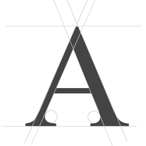
Effective Typography
Typography is more than just type-face and readability. It also contributes to the flow and style of your website. For example, serif fonts (fonts with ligatures, like Times New Roman) have a classic look that’s often associated with royalty or formalness. Similar to colors, you want to limit yourself to 1 or 2 font families: one for headlines and one for body copy.
Graphics
Graphics include any imagery that should be used to enhance your content. Don’t simply add graphics just because they’re pretty or because you need to fill a space. Every part of your website is valuable real estate! Also, keep your graphics consistent. If you’re using illustrations, keep the style consistent throughout the website.
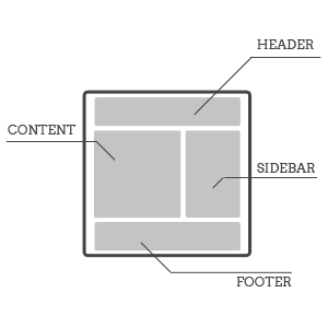
Layout (UE/UI)
Simply put, this is how your website is laid out. This is very important because it affects how your visitors use your website. For example, how will putting your navigation right below your header instead of in the sidebar affect your users? My rule of thumb is to go with what works and then test, test, test! Just because it works, for the time being, doesn’t mean you can’t make it better. If moving an element to the left side tests better than when it was on the right side, MOVE IT! Love your data!
Calls to Action
Your website serves a higher purpose, and no I’m not referring to religious callings. Whether you are selling products/services or simply want more readers, “calls to action (CTAs)” are arguably the most important parts of your site. We believe that there should always be a CTA visible, regardless of where a visitor is on the page. For example, there should be one in the header, another in the footer, and one in the middle of the page. This may sound like overkill, but all CTAs do not have to look the same or even be the same. You can have a phone number in one area and a form in another. Do what works for your site!
