Most people have a general sense of what does and doesn’t look good or what works and doesn’t work. People who are paid to design and build websites should have a really good idea of what will appeal to people. So, why do we continue to make some of the biggest design sins?
Modern websites or “Web 2.0” have changed how we read, view, and use websites. We are no longer limited to the most basic forms of HTML (IE: tables and iframes). In fact, we have every reason to be creative, especially because web design has become more about psychology and functionality.
Nevertheless, here are a few web design mistakes and rules of thumb every designer should know.
1. Pop-Ups/Auto Play
You don’t like it when someone interrupts you by shoving a piece of paper in your face, right? Well, your website visitors don’t like it, either, when you pop up something over what they’re trying to read or watch. And, they really don’t like to be barraged with noise when they aren’t expecting it. When these tactics are used on a site, they’re used to bring attention or force action. But, there are far more creative ways to get a visitor to take a converting step.
The best websites guide users to take action through subtle visual cues. Websites function best when the user can find exactly what they need to do without having to guess too much. You can even use psychological or physical constraints (read more on webdesigndepot.com).
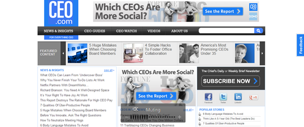
Example: CEO.com has a great example (and many sites are doing this). If you look to the far right of the page, there’s a Feedback button. It’s visibly noticeable, it doesn’t invade the space I’m most interested in, and I can choose whether or not I want to use that tool.
Resources:
- 10 Usuability Nightmares You Should Be Aware Of
- Why You Should Avoid Pop Ups
Fonts
Typography is an art form in itself, and the nuances will never be obvious to everybody. However, there are some basics everyone should know:
1. Don’t use more than 3 fonts on your website (2 is preferable).
Typography helps your website define a hierarchy, so really you should only need one font for the body copy and another (if you want) for the headlines. Sometimes, you can get away with using another font for blockquotes, or discreet blocks of text, but I find that two is usually enough. Using multiple fonts can cause a lot of problems with your design and load time. If you use uncommon fonts, not every computer/browser will have the fonts you’re referencing, and if they don’t, it may take longer to load your page or load a default font that causes your site to look sloppy. Be conservative and choose wisely!
2. Look at it yourself.
It’s tempting to get a little “cray” with fonts (family, size and style). It’s an easy way to make a block of text more interesting. However, it doesn’t mean it’s interesting for everyone, it might hurt readability, and it definitely doesn’t mean it looks good. Designing for the web means you’re designing for the general public and/or your target audience. Think of them as you choose how your fonts function and look. Test it at multiple sizes and browsers as often as possible. If you think it might be hard to read for anyone, it is.
Your site is no good to anyone if nobody can read what you have to say.
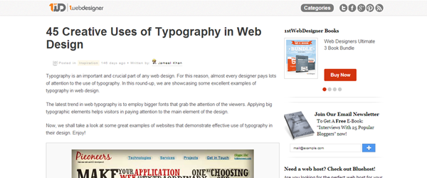
Example: 21 Examples of Inspiring Typography in Web Design
Here are different examples of different cases: creative and practical. Pay attention to what the website is for and how the typography functions within that space.
Resources:
- Typography Guidelines and References
- 10 Typography Rules Every Designer Should Know
- 12 Typography Guidelines for Good Website Usability
Clutter
“Simplicity is the ultimate form of sophistication.” – Leonardo de Vinci
There’s a reason we love Apple so much – everything they do is simple and clean. They use the minimal amount of color/distractions and prefer to speak through other modes in their product (IE: functionality).
Your websites should emulate Apple’s example. While we can’t always keep it as simple as Apple, we should strive to “cut the clutter” where it’s not needed. A good rule of thumb is to judge whether or not the element has at least two purposes. For example, if you have your cat on your website when you sell movies, there’s no reason your cat should be there – especially if he’s there because YOU think it’s cute. Of course, if your cat is a mascot for your company then that’s a different story. That is an example of a possible web design mistakes.
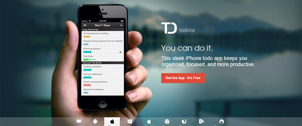
Example: Following the Apple.com website, the ToDoist.com solely focuses on its products and their selling points. It’s easy to digest without too much reading and distractions.
Resources:
- 7 Interface Design Techniques to Simplify and De-Clutter Your Interface
- 5 Web Design Mistakes
Animations
I love animated movies as much as the next little kid but there is a time and a place for them.
When used properly, animations can liven up your website in the most beautiful ways. I often find that the most powerful websites use subtle animations within the background or within the functionality. Unfortunately, I often run into sites that use multiple animations (commonly GIFs) where they aren’t necessary. This goes back to the “clutter” section above. When choosing to use an animation for your site, ask yourself, “Is this necessary?” and, “How does this make my website better?”
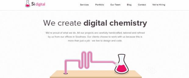
Examples: On this SiDigital.co, the animation is triggered by visitors as they scroll through the site. It’s subtle, engaging and relevant.
Resources:
Design for the Sake of Design
There is an argument that beautiful things are easier to use. This is often confused with the idea that just because it is beautiful, everyone will want to use it. As explained by AListApart.com, aesthetics is about more than just how something looks – it’s how it functions, as well.
Web design should follow the principle of function over form. You’re designing for an interactive space that is continuously evolving. Especially with issues such as browser compatibility and mobile devices, you have to find that perfect balance between beauty and usability.
Because you have an opportunity to make something “pop,” that doesn’t mean you should take it. If you hired a designer, you should trust their sensibilities, but make sure there is a reason for everything. Don’t let them make web design mistakes that could cost you later.
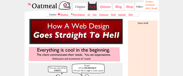
Example: Not an example but definitely relevant: Design Hell (comic).
Resource: